12-13 1,854 views
参考http://www.runoob.com/w3cnote/flex-grammar.html
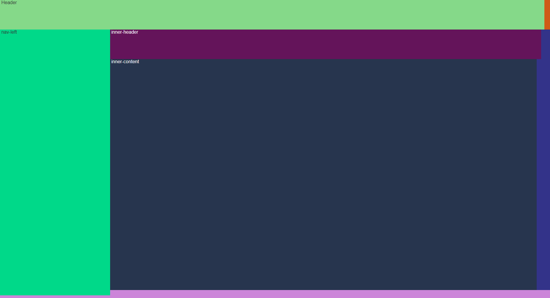
<template>
<div class="main">
    <div class="nav">
        Header
    </div>
    <div class="content">
        <div class="nav-left">
            nav-left
        </div>
        <div class="container">
            <div class="inner-header">
                inner-header
            </div>
            <div class="inner-content">
                inner-content
            </div>
        </div>
    </div>
</div>
</template>

<script>
export default {}
</script>

<style>
.main {
    background-color: #cf5a17;
    height: 100%;
    width: 100%;
    display: -webkit-flex;
    /* Safari */
    display: flex;
    flex-direction: column;
    flex-wrap: nowrap;
}

.nav {
    display: inline-flex;
    background-color: #85d989;
    width: 99%;
    height: 100px;
    flex-grow: 0;
}

.content {
    /* Safari */
    display: -webkit-flex;
    display: flex;
    background-color: #cc85d9;
    height: 50%;
    /*铺满剩余空间*/
    flex-grow: 1;
    flex-shrink: 0;
    flex-direction: row;
}

.nav-left {
    background-color: #00d989;
    width: 20%;
    height: 99%;
}

.container {
    display: -webkit-flex;
    display: flex;
    color: #fff;
    background: #333389;
    flex-grow: 1;
    flex-direction: column;
    height: 97%;
}

.inner-header {
    color: #fff;
    background-color: #64145a;
    width: 98%;
    height: 100px;
    flex-grow: 0;
}

.inner-content {
    color: #fff;
    background-color: #27354e;
    width: 97%;
    height: 100px;
    flex-grow: 1;
}
</style>